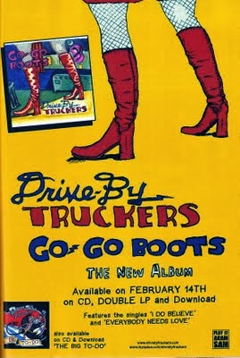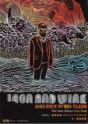

This magazine advert for a music album is very creative in the way everything has been presented. The use of font in on the magazine is very original, artistic as well as bond. In comparison with the other magazine advert this use of creativity makes the "Drive By Truckers Go Go Boots" album cover look boring. The concept throughout the "Iron and Wine" advert is lines which displays very abstract images, it is filled with lines of different colours which has been used to create effective patterns and shapes making the album cover look more eye catching and unmissable. The use of colours makes certain aspect in the advert stand out more than others such as the orange lines used to draw the man's blazer. This is a symbolic attribute used deliberately to draw attention to the man showing us that he has some sort of correspondence to the album. The images of the peacocks in the background brings a sense of mystery and confusion as to what relevant they have and questions the artist for using such animals out of every other option. This can be seen to be effective because it gives the audience a reason to be more interested in the album because of such strange attributes.
Both of these magazine adverts are very different in the way they have been presented and the ideas behind the whole image. However both magazine adverts have some similar elements such as . displaying the release date/ availability of the album. The album by Iron and Wine advert displays their album to be "Out now"which informs people that they can go and buy the album now. The album Drive By Truckers Go Go Boots also displays an avalaiblity date of the album as it states that it is out Frebruary 14th. These similar attributes are common across all magazine adverts for music because it is a vital piece of information ti inform people otherwise they wont know when they can buy the album.
The album 'Drive' by Truckers is very comic in the way the images and font in the writing has been presented. This could be a symbolic aspect to the music album as it could indicate that the album is targeted at the younger audience. Furthermore, the title contracts with the image displayed on the advert as there is an image of a women in boots and the albums title is 'Go Go Boots'. This shows us that the presenters have really thought about the images and titling before presenting it on the magazine advert. The album also has a picture at the top of the magazine advert of the front album cover, the other album by Iron and Wine does not have this on their advert. This is effective and useful because it shows people how the album looks like on display in stores so that viewers can easily identify the album.
No comments:
Post a Comment