Thursday, 27 February 2014
Audience feedback of rough cut
We are finally close to finishing our music video 'Superman' by Behind Bad Luck, there are just minor adjustments which need to be make. This will be done in our media lesson tomorrow so our video will fully completed this week! thank God. One of our media teachers and two of our class members have had a look a look at our rough cut and made some interesting comment which we act on as much as we can. One of the comments made was regarding one of the scene in London when we are dancing in Westminster Bridge about 2:50 into the video. It was highlighted that we needed more alternating shots as there was just a long footage of that one scene for about 50 seconds which was why we wrote 'Placeholder' across the footages which we're looking to change. Our audience watching this rough cut said the long footage "Killed the ending a bit" because it made the video drag and look dull. In light of the comment we will alternate the shots to another location such as the band performance scene. This will make the minute or so of the video just as engaging as the rest of the video with the variety of shots well will look to add. Furthermore, at the beginning of the video after watching it back a few times we realised that the wind from the background when Tom was sitting on the swing made that short footage sound very unprofessional and mediocre. In our next editing session we will mute this sound so that it blends in more with the other footages which are followed after the part with Tom sitting on the swings. Another element which was spotted in our rough cut is a moment in the video near to the end were the lip syncing is off. It was good that this was spotted as we did not even notice it, now that we are aware of this we will act on it tomorrow when editing, this should be a minor amendments as all we will have to do is move the sound track. Apart from these improvement aspects all of our viewers overall commented that our video was very "Interesting to watch" with "Good humour". Such comments was a relief as it reassured me that all of our efforts filming and editing wise have gone to good use.
Tuesday, 25 February 2014
Friday, 21 February 2014
Digipak Preparation
With our digipak we are looking to make it as symbolic as possible. In order to do this we are going to add as much Ska associations on the covers and also real images straight from our music video. This will be very effective because it will show that it is all our own work and that we have thoroughly thought about the best way to present our music video. On a side or multiple sides in our cover expect their to be a sort of black and white checkered background as a base which we will put a variety of images, texts ad designs on. We will try to make these as relevant as possible in terms of saying something about the music video. When doing this we will not try and make the ideas we're trying to display too complex. I personally find that very annoying and pointless because many musicians album covers look meaningless as after listening to the songs on the album the relevance to the cover designs appear to be nonexistent. I believe that it is important for there to be a relation between the cover and the song(s) in the CD otherwise there is no real point of the cover if it is not giving the audience a taste of the song(s) in the CD so that they have an idea on what to expect before purchasing.
Ideas in relation to genre and band
I used onetruemedia.com to put together a group of images from google and also real life images we took when out looking for filming ideas. These images have a relationship with the type of genre we hope to make our music video on and are also an embodiment of ideas which the band display from what I know via research.
Illustrate audience research findings using Wordle
I have used the website Wordle to put together a variation of words and phrases which I think the audience would like a music video to consist of. I have based these ideas via the responses I received from my survey monkey questionnaire and some of the ideas stated in the focus group activity.
Friday, 14 February 2014
Audience research; Survey monkey
Create your free online surveys with SurveyMonkey , the world's leading questionnaire tool.
I have shared my survey monkey link on my Facebook page to my followers via my iPhone whilst am out socialising with friends and then took a screen grab of the page and pasted it straight on my this blog post by using my Blogger app on my phone. This highlights the beauti of the iPhone as I am able to commuicate any form impormation whenever I want without having to be on a computer.
I have shared my survey monkey link on my Facebook page to my followers via my iPhone whilst am out socialising with friends and then took a screen grab of the page and pasted it straight on my this blog post by using my Blogger app on my phone. This highlights the beauti of the iPhone as I am able to commuicate any form impormation whenever I want without having to be on a computer.
Monday, 10 February 2014
Famous album analyse
London rap artist DVS has released his new album called 'London Boy American Dreaming'. Lately I can't stop but listen to this album, it is that good, after looking at the description objective for this post this album was the first to pop up in my head because the cover is very significant in saying something to the audience, also has a relationship with the songs and the concept of the album is very clear by just looking at the cover which I thought was very important as a lot of album covers these days are very complex in the message it try's to portray, this album displays otherwise and brings things back to basic but also in an effective way.
The font used in the cover is very eye catching and displays elements of originality with the way it has been written sharply. Furthermore the way the text has been written across the middle of the cover makes it even more significant because it is the centre of attention, this presentation is very important and effective because without looking at the images on the cover the title alone already gives implications as to what the album will be about. This relationship between the title and songs on the album shows us how relevant every piece on the cover is, it also shows the audience that the album has been well thought about. The colour scheme used in the text is also look really good as it makes the whole writing stand out more. His name is DVS and the name of the album is London Boy American Dreaming; this written text has been separated via the use of font size and the colour scheme gold and white. This attribute can be seen to be important as it there was not a change in the colours unfamiliar viewers can easy miss interpret and thing the whole line is the artist name or name of the album.
The use of images on the cover of the album are all significant in saying something to the audience. As well as this they also look very interesting and engaging especially with the use of fade in merging all three images of Big Ben, the artist and the American flag together. The way the artist has been placed in the middle amount the other two footages emphasis the idea again of something being the centre of attention, in this case the artist is spread out through the centre of the page which show us his relevance in the album. The use of the image of Big Ben in the background is also significant in the whole album because it is an iconic representation of London. If you look at the artist's sunglasses, on the left eye you can see the town Brixton written. This is significant because it shows us where the artist is from which is in Brixton, this corresponds to the title of the album stating 'London Boy' as Brixton is in London which he is clearly proud of it and also songs within the album such as 'Brixton' and 'Different kind'. On the right hand side you can see an image of the American flag and on the artists right eye in his glasses an image of the state of liberty. This is effect because it displays ideas to the other half of the message behind the album. This tells us that America is where he would like to be in, this also corresponds to the title of the album as it states 'American Dreaming' which is very much self explanatory in the aspirations in the future.
Last day of filming!
Yesterday was our last day of filming which was such a relief as all the jorney's to London were proving to be very costly. Yesterday we went to Tower Hill to film some more group footages, we felt that it would be important for us to vary our filming locations rather than going back to Piccidally Circus. Tower Hill proves to have been a good idea as it was very busy with lots of tourists and had a number of iconic landmarks such as the house of parilment were mayor Boris Johnson works in. We also managed to record some footages of the lead singer Tom singing with 'The Shard of Glass' in the background. As little as it may sound we felt that it this will make a good contribution to the rest of the footages we have, it also emphasises the idea that we have really thought about the locations we film at rather than just focusing on following the storyboard shots.
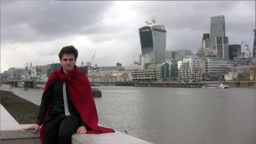
The weather yesterday wasnt as bad as it has benn in our past filming sessions. Although, it was very cold and windy but it could have been worse such as if it rained which lucky it didnt even though the forecast stated that there would be light showers. As well as visiting Tower Hill we also went to Westminister Bridge where we simply filmed our led singer Tom fully in his acting role of Superman. We filmed some footags of him running around Town doing silly things pretending to be Superman and annoying the rest of the band members with his crazy imagination. We got lots of footages for this so that we will be left with excess footages which we can use if we run out of shot variaton whilst editing.
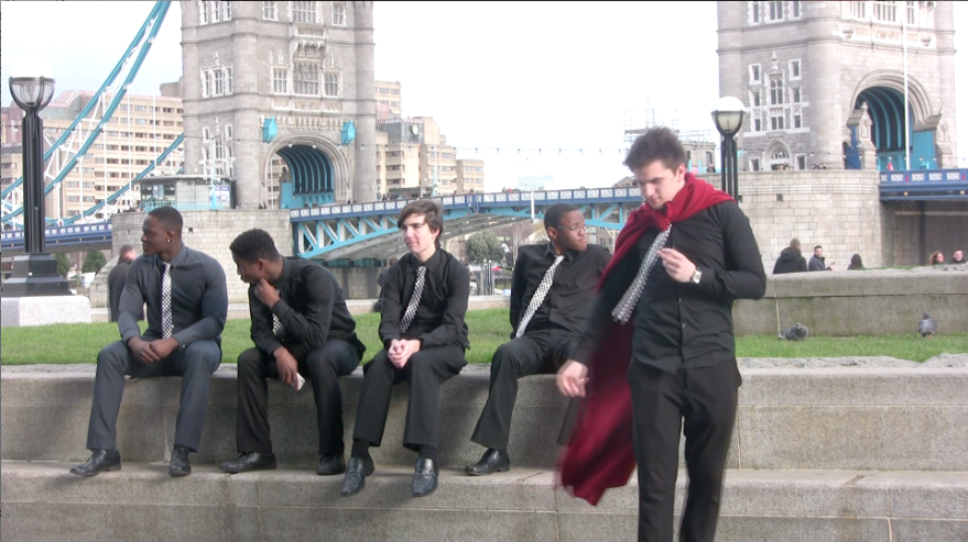
Overall I can definatly say that I have enjoyed the filming stage. It has not all been constant hardwork but me and the rest of the team have had some hilrious moments during our trips to London. We are looking to add a 'Behind the scene' video or if not a post of photos of lots of random highlights from our filming sessions to display a glimpse of some of the things we got up to outside of the music video prepartion so look out.


Overall I can definatly say that I have enjoyed the filming stage. It has not all been constant hardwork but me and the rest of the team have had some hilrious moments during our trips to London. We are looking to add a 'Behind the scene' video or if not a post of photos of lots of random highlights from our filming sessions to display a glimpse of some of the things we got up to outside of the music video prepartion so look out.
Thursday, 6 February 2014
Analyses of student magazine advert
The 'four star' rating of the single at the top of the advert is effective because it shows viewers that the single has been highly rated meaning it must be good. This is good because it will persuade viewers to want to buy the single as it has been described as "breath-taking" by the newspaper company The Guardian. At the bottom of the advert the release date and places where people can obtain the single is evident; "Release date 14.02.12" and has specialist music stores HMV and iTunes logo. This is a key feature across all album/CD magazine adverts so this magazine advert by past student Amanda has displayed traditional features.
The colour scheme used in the advert is black and white which displays an old fashion theme. This correspond with elements in the image as she has a sort of cotton clothing around her neck, peal earrings and short hair. This is how women in the olden day looked like which emphasis the idea of the whole old fashion image. The title displayed at the top of the magazine advert has been written in red, the release date has also been written in red and the shade of the girls lipstick on the cover is also red. This creates a blend in colours which makes the whole advert look more unified because there is a relationship between the text used and the image. This makes the whole advert look more appealing because if the text was another colour such as green or blue the advert would look very odd and stand out in a obscured way.
The way the image of the student who made the music video covers the majority of the magazine advert is symbolic in saying something about the single. This informs viewers that she is the centre of attention who the whole music video is about. This gives us a greater understanding to the single as viewers will now know who the song and events within the video will be about. The way the artist's face is bang in the middle of the page reinforces her superiority in the music video. It makes her impossible to miss and will subconsciously catch views eyes.
Tuesday, 4 February 2014
Magazine Advert Analysis
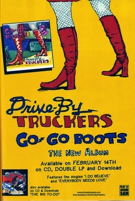
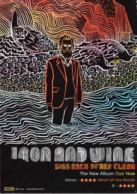
This magazine advert for a music album is very creative in the way everything has been presented. The use of font in on the magazine is very original, artistic as well as bond. In comparison with the other magazine advert this use of creativity makes the "Drive By Truckers Go Go Boots" album cover look boring. The concept throughout the "Iron and Wine" advert is lines which displays very abstract images, it is filled with lines of different colours which has been used to create effective patterns and shapes making the album cover look more eye catching and unmissable. The use of colours makes certain aspect in the advert stand out more than others such as the orange lines used to draw the man's blazer. This is a symbolic attribute used deliberately to draw attention to the man showing us that he has some sort of correspondence to the album. The images of the peacocks in the background brings a sense of mystery and confusion as to what relevant they have and questions the artist for using such animals out of every other option. This can be seen to be effective because it gives the audience a reason to be more interested in the album because of such strange attributes.
Both of these magazine adverts are very different in the way they have been presented and the ideas behind the whole image. However both magazine adverts have some similar elements such as . displaying the release date/ availability of the album. The album by Iron and Wine advert displays their album to be "Out now"which informs people that they can go and buy the album now. The album Drive By Truckers Go Go Boots also displays an avalaiblity date of the album as it states that it is out Frebruary 14th. These similar attributes are common across all magazine adverts for music because it is a vital piece of information ti inform people otherwise they wont know when they can buy the album.
The album 'Drive' by Truckers is very comic in the way the images and font in the writing has been presented. This could be a symbolic aspect to the music album as it could indicate that the album is targeted at the younger audience. Furthermore, the title contracts with the image displayed on the advert as there is an image of a women in boots and the albums title is 'Go Go Boots'. This shows us that the presenters have really thought about the images and titling before presenting it on the magazine advert. The album also has a picture at the top of the magazine advert of the front album cover, the other album by Iron and Wine does not have this on their advert. This is effective and useful because it shows people how the album looks like on display in stores so that viewers can easily identify the album.
Proposal as to how to expand, broaden audience/ increase sales
In order to make a music video profitable it is important that the public are aware of the product. In order to do this it is important to do some research and think about the best way to advertise the product with the greatest chance of increasing profit margins so that it doesn't result to being a waste of time and money. In addition to this, as well as making people aware of the product it is more important that a specific target audience is being targeted. This is because this section of people are the ones who will most likely by the CD because there are interested in maybe the genre evident on the music. For an example, if an a rap album was being released by an artist in order for the artist to to be in the best position in order of receive profit is to make the younger generation aware of the album, more specifically the male section because they are ones who would find such genre appealing.
In order to connect with this section of people specific media conventions should be used such as advertising the album on social networking sites such as Twitter, Facebook and Instagram. These networking sites are very popular amongst young people especially Twitter, every single one of my friends both in and outside of school has Twitter which highlights how popular it is.


Being a rap artist i would also want to display display posters advertising my album on or near public transports such as on buses or displayed underground in order to get a broader audience to see the releases of the album so that they may want to purchase it if the find the looks of it appealing even though they may not be part of the target audience category. This will contribute in helping the artist broaden there audience In order for the album to be appealing to people once they know about the product there must something about the product that makes it stand out from other CD's. This aspect can be achieved by making the album digipak as eye catching and attractive as possible, something iconic that will stick into people's heads and gives them a reason to want to buy the album by looking at it. One of my favourite rap album cover is from an American rapper called 'Meek Mill' and the album is called 'Dream chasers 2'. I like the cover for this album due to the use of special effects, it has helped made the cover look extremely eye catching especially with the use of colours, theme and style of text font used.
In order to connect with this section of people specific media conventions should be used such as advertising the album on social networking sites such as Twitter, Facebook and Instagram. These networking sites are very popular amongst young people especially Twitter, every single one of my friends both in and outside of school has Twitter which highlights how popular it is.


Being a rap artist i would also want to display display posters advertising my album on or near public transports such as on buses or displayed underground in order to get a broader audience to see the releases of the album so that they may want to purchase it if the find the looks of it appealing even though they may not be part of the target audience category. This will contribute in helping the artist broaden there audience In order for the album to be appealing to people once they know about the product there must something about the product that makes it stand out from other CD's. This aspect can be achieved by making the album digipak as eye catching and attractive as possible, something iconic that will stick into people's heads and gives them a reason to want to buy the album by looking at it. One of my favourite rap album cover is from an American rapper called 'Meek Mill' and the album is called 'Dream chasers 2'. I like the cover for this album due to the use of special effects, it has helped made the cover look extremely eye catching especially with the use of colours, theme and style of text font used.
Subscribe to:
Comments (Atom)


